Building of the Week No. 1
In order to bore all ye to tears, if I haven’t already done so, I have decided to post about a different building every week. If it’s any consolation none of the architects, if any, (Ian are you out there?) reading this blog will find these posts any more interesting than you will!
The motive for doing this is slightly selfish. In college we were thought to sketch a detail or building we found interesting as the simple act of drawing demands greater attention to the subject matter. The alternative is to point and click the camera. When you do that your camera takes the place of your eye, the aperture is your iris, the shutter your eyelid if you get my drift.
In many respects doing a blog is similar, in the sense that it helps you to “sketch” the places you visit. It forces you not to become complacent as you always have your blog content in mind.
Anyway in an effort not to be taken too seriously I have decided that my first building of the week is an electrical sub station. If the relationship of beauty to ugliness could be expressed as a circle then there’s always the odd thing that is so ugly it touches beauty. There are some buildings which are deliberating designed with this in mind but I think this one was not so contrived. Here’s a taste of what I am talking about.
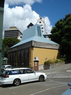
This building is tucked into an alleyway between a building and a retaining wall and in many respects it deserves and would have been far better to be free standing. The reason I think this is because its symmetry suggests that it is “double fronted” when in reality it is not and cannot be with the retaining wall so close to the rear.
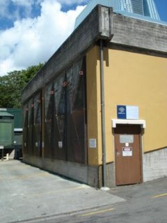
I really like the doors because they were oversized and almost monumental, the material looked like natural or un- patinated copper which also gave them a sense of grandeur which suited the fact that they were oversized. I can only presume that the cross rib detail on the doors is due to their size and helps to keep them rigid when they are being removed for access. Form following function and all that.
They seemed to have run out of budget when it came to the roof or someone got happy with the wrong coloured paint. I can only imagine that the person who went to the bother of detailing the roof so cleverly including the natural ventilation would have wanted it to be made in the same material as the doors. The concrete ring beam above the doors is a bit clumsy also and deserves the finer detailing of the remainder of the building. Perhaps they ran out of money. Here’s a close up of the doors. You can see the supports on the corners for lifting the doors off.
 A lot of people mind find this building simply ugly, but it caught my eye from across the street and I was drawn to it immediately. Yes there are “grander” and “prettier” buildings in Wellington, but I really was taken with this one. People might find the shape of the roof slightly unusual but it reminded me of an abstracted version of a more traditional roof that most people would be familiar with. The pictures below show a traditional house in Wellington.
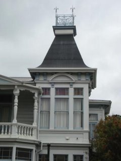
Did I mention that you might have to use your imagination!
Cathal
Labels: Architecture, New Zealand, North Island, Wellington
posted by Sharon in Ireland/NZ @ 8:18 PM
2 comments
![]()